ProHealth Longevity
Brand Design
Visual Design
Creative Direction

Homepage Design Update
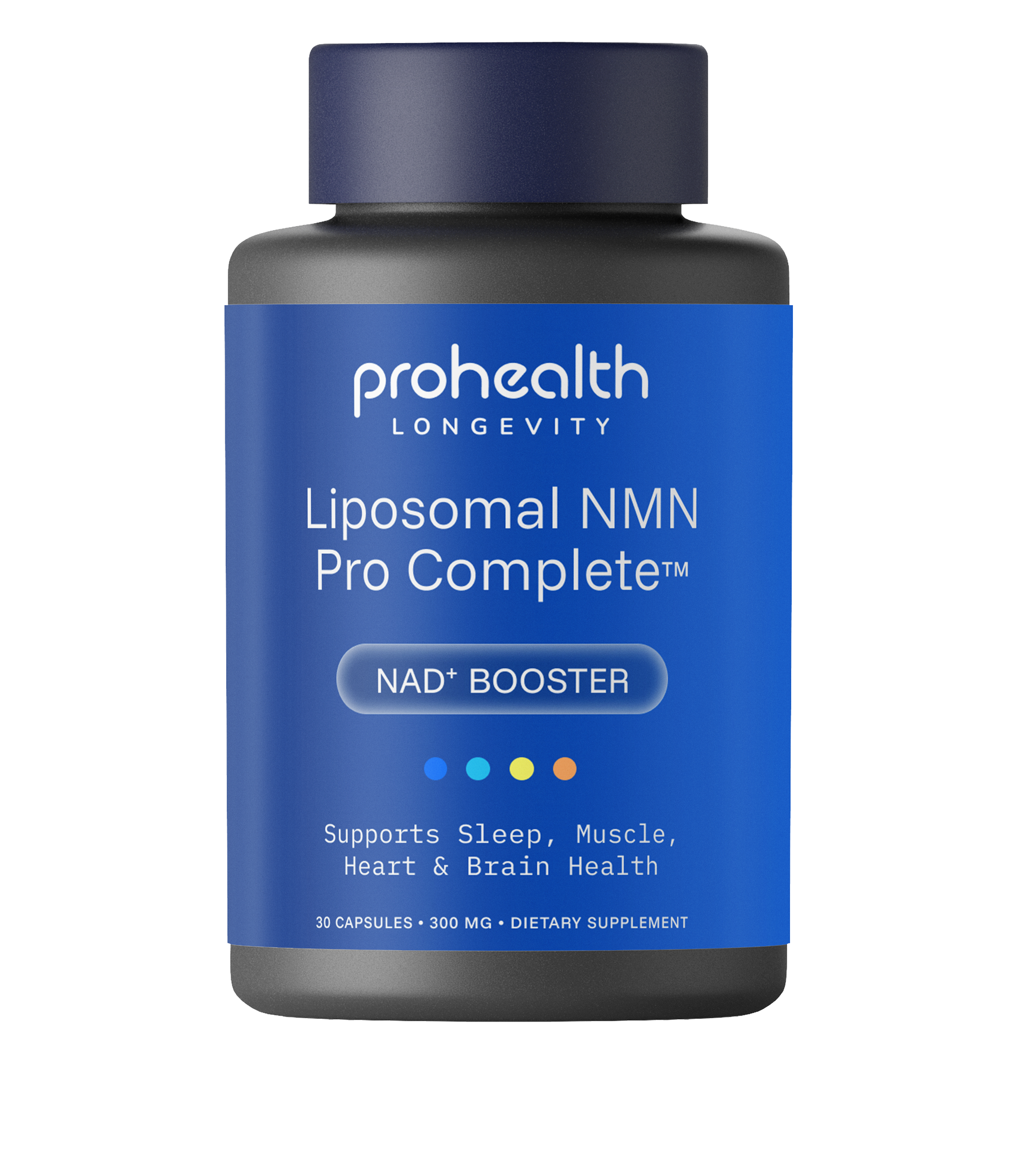
Label Exploration
I initiated this project after seeing a large gap in our ecosystem identifying usability issues and ADA compliance issues with colors and font sizes. I was asked to keep the same content but reimagined in new brand guidelines. This redesign was aimed at creating clear, accessible and conversion-focused homepage that communicates ProHealth’s current content more concisely.
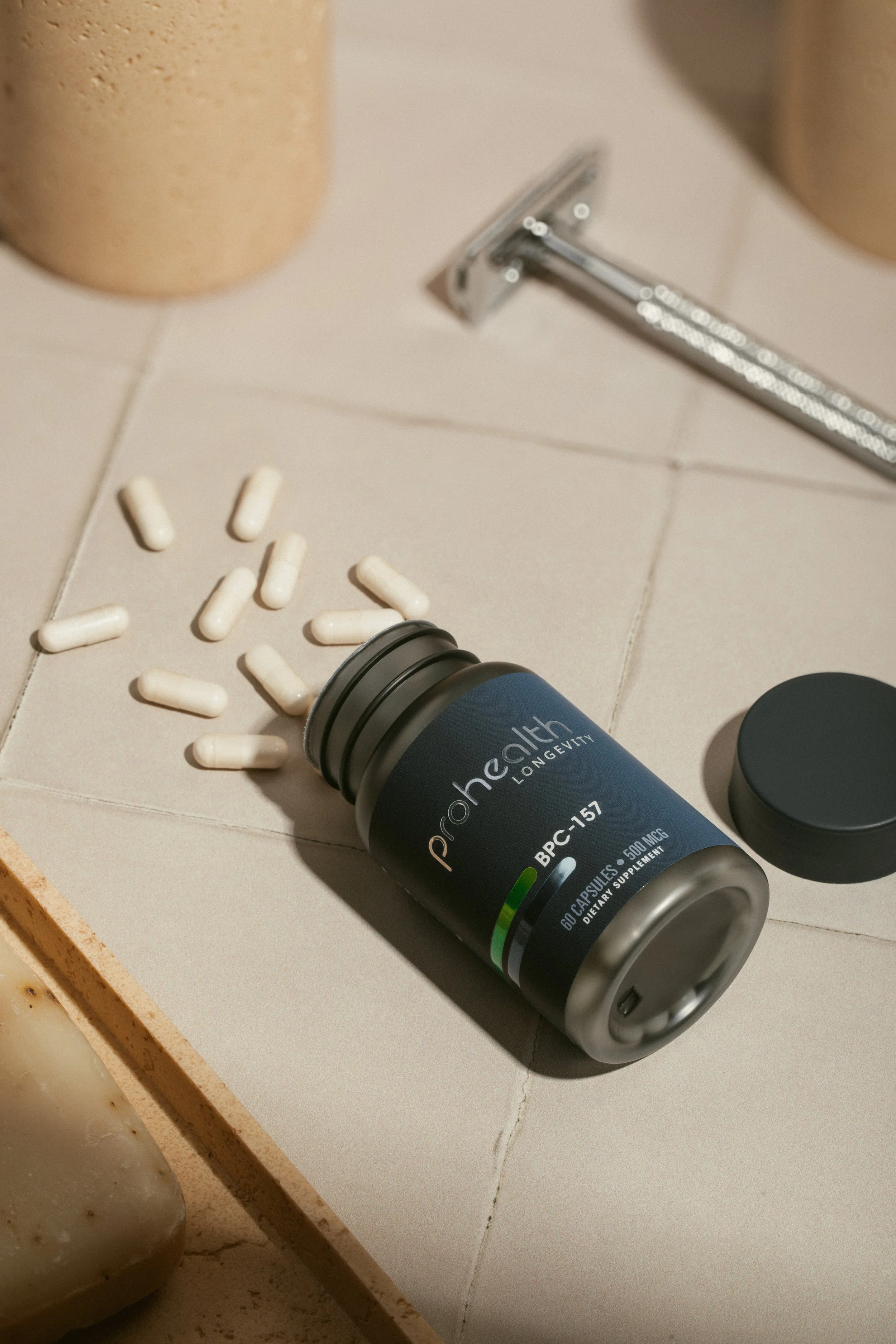
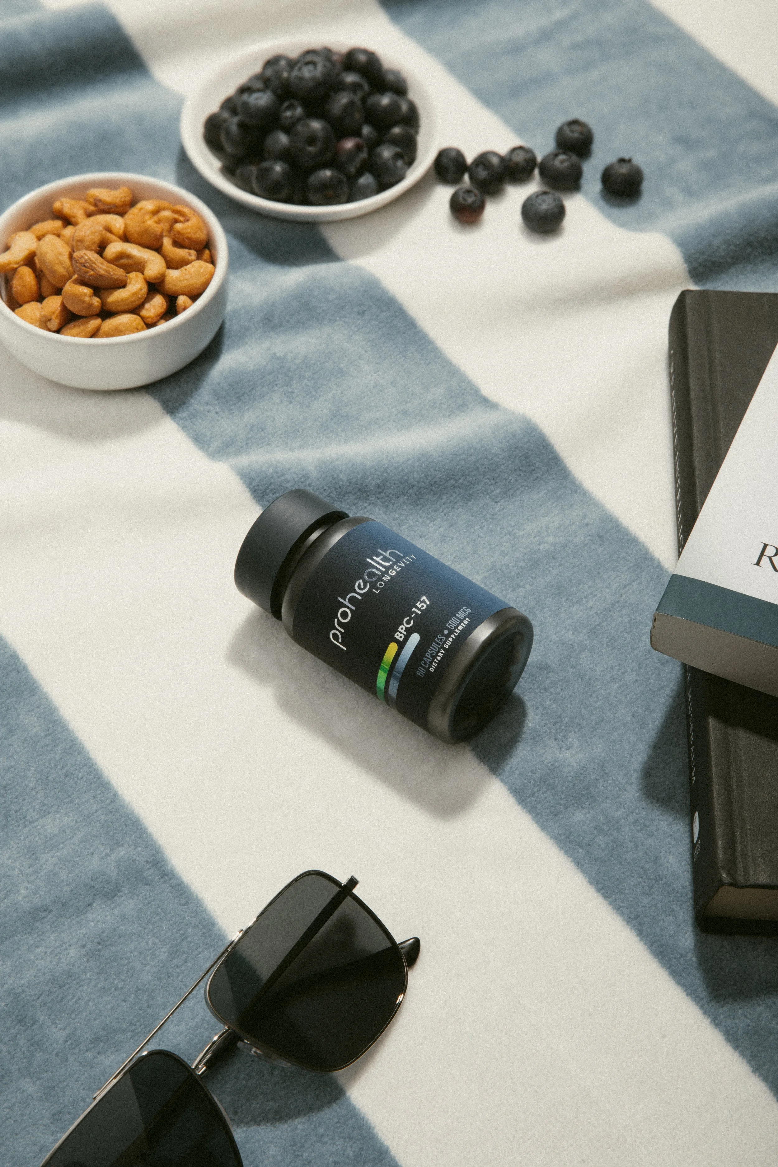
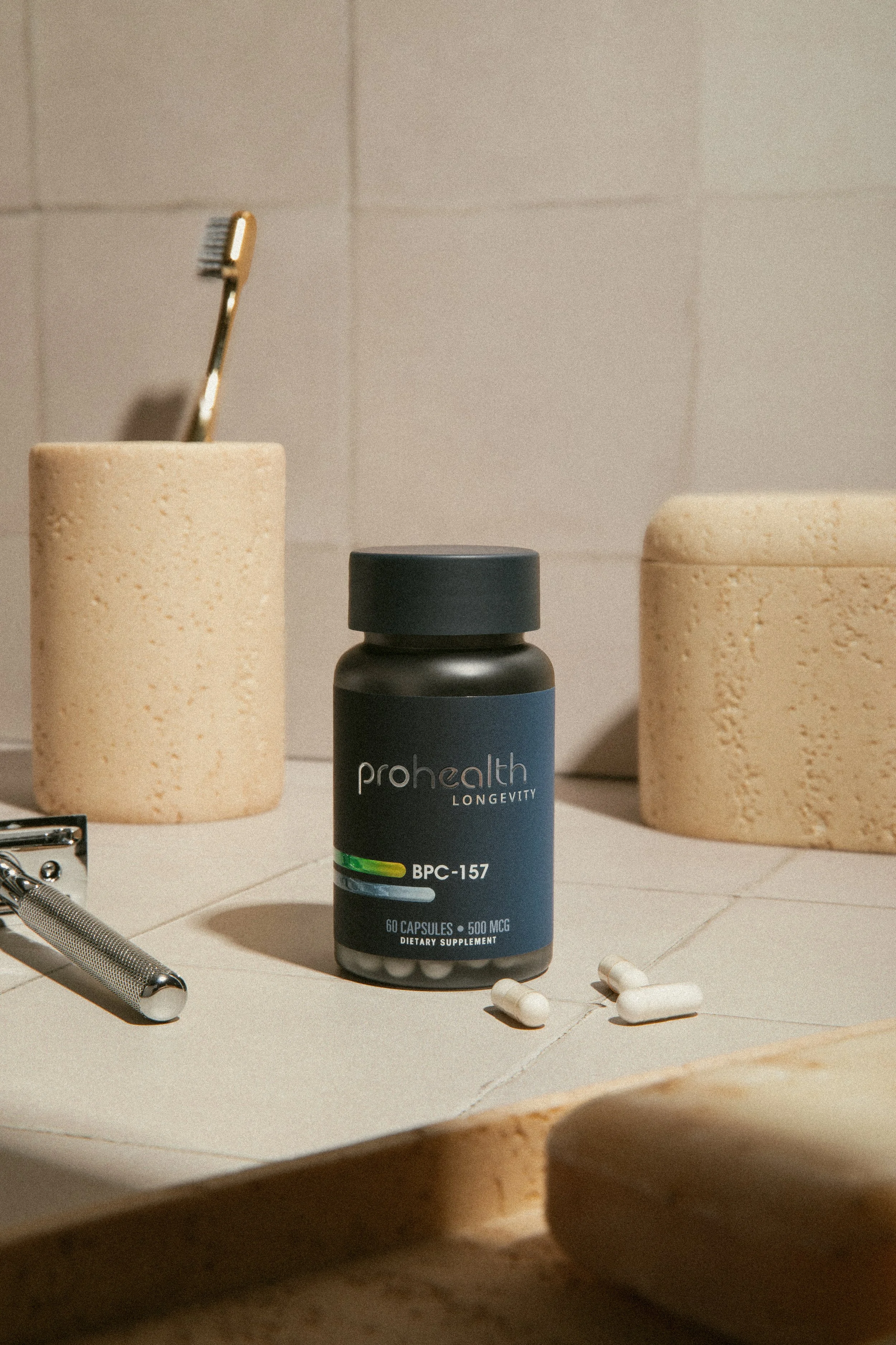
Product Photography
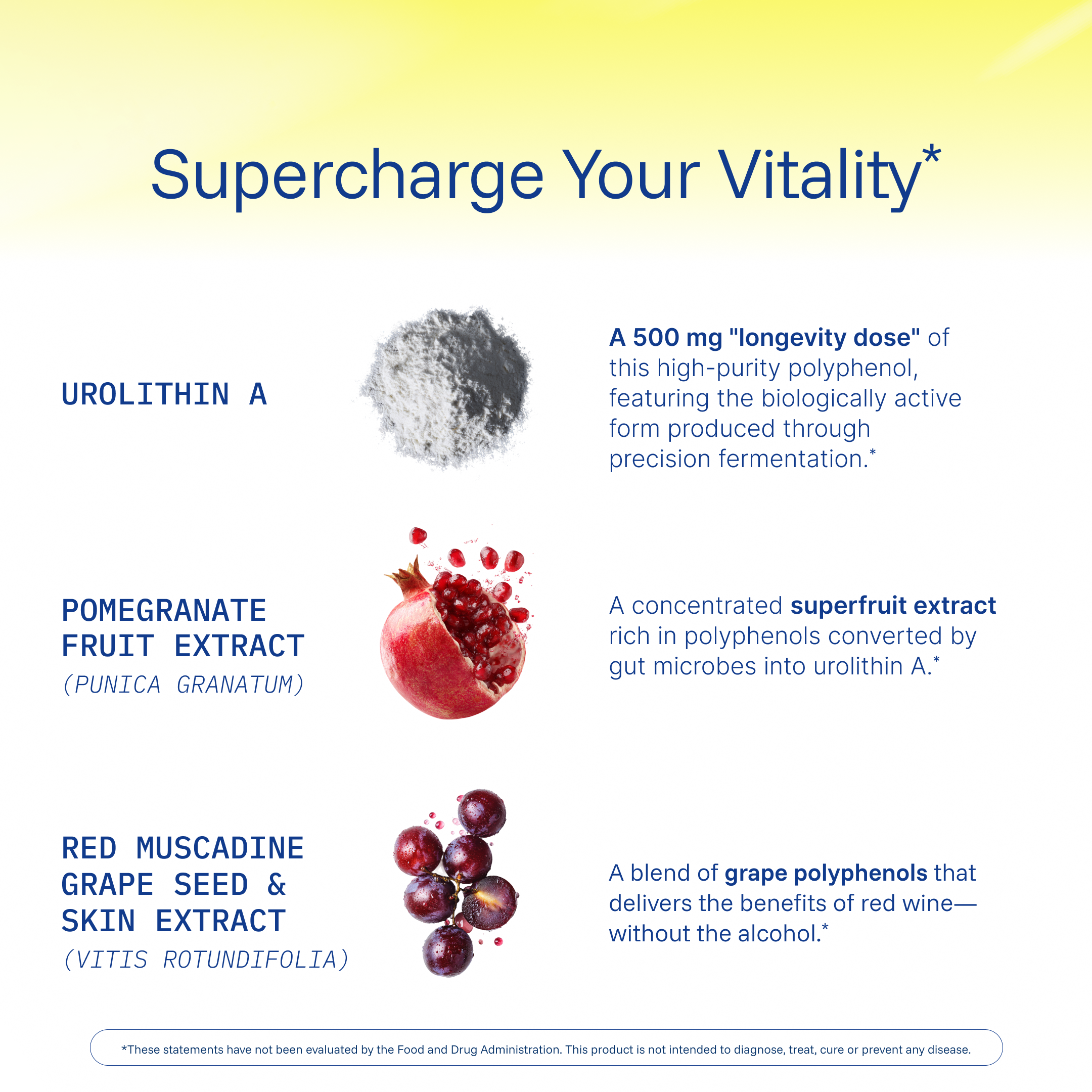
Collaborated with an agency to establish the visual direction and overall look and feel for the brand’s inaugural product photography shoot. Led creative direction on set, providing visual references, guiding composition and styling, and making real-time decisions to ensure the final imagery aligned with the brand vision.
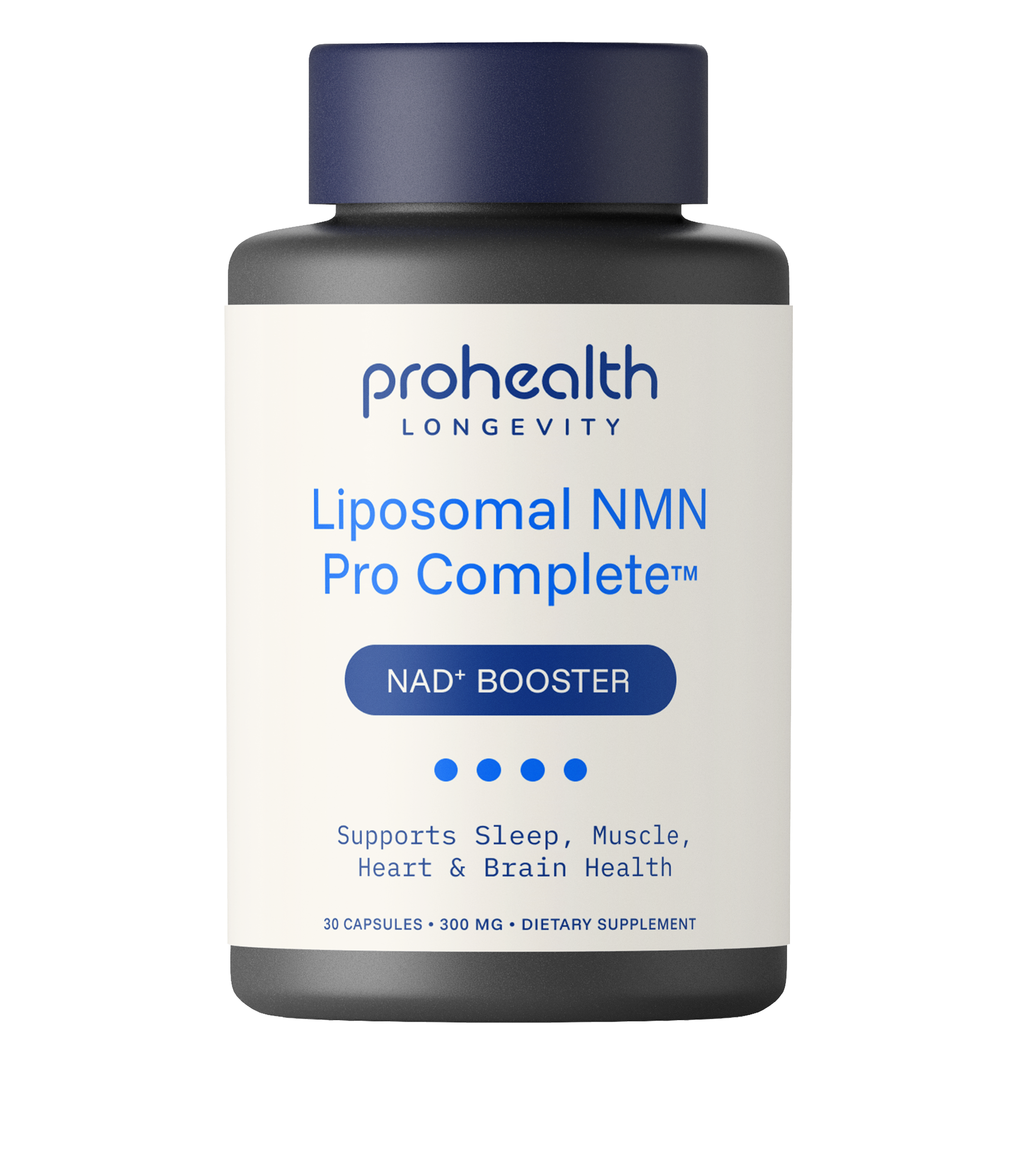
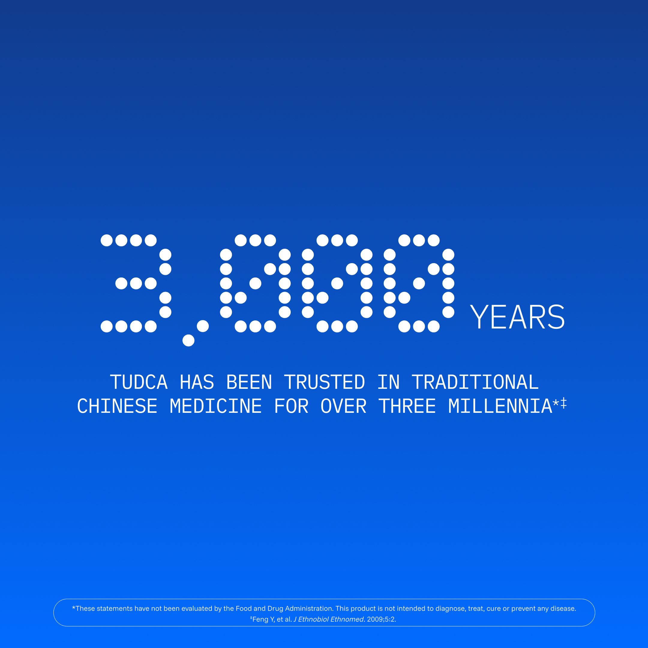
In this label exploration, I focused on improving areas where the current design falls short — namely product name readability, benefit callouts, and overall information hierarchy. I explored two color directions, with the cream option serving as a potential look for our general product line. The dot-matrix asset from our updated branding adds dimensional color to the bottles and can also function as a clear system for product categorization.
Amazon Brand Store
The Amazon brand store was updated to better match the company’s new identity. Products are now grouped more clearly, and their benefits are explained in a consistent, easy-to-follow way. The store highlights key formulas in organized categories, helping shoppers quickly understand each product’s purpose and quality. Overall, the redesign creates a stronger, more unified brand presence across all marketplaces.

Email Marketing


Some examples of emails applying new brand guidelines and gaining a higher open and click through rate through consistent design